
It’s great to be back writing the Chart Advisor again all this week! A lot has changed since my week in October, and it will be fun to continue on this journey.
1/ Seasonality
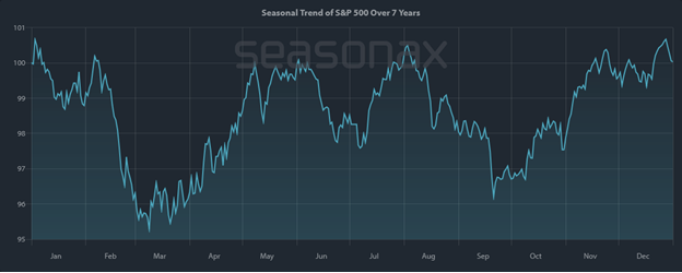
One of my favorite ways to start the week is to check in on Seasonality. The chart below illustrates the S&P 500’s performance over the past 25 years, specifically during the first year of the presidential cycle, for the seven most recent US presidents. While that’s not a huge sample size, a wide range of scenarios and economic backdrops have tended to act somewhat similarly. And so far, 2025 is following this playbook remarkably well.
Seasonality looks at the average movement of an index, stock, etc., on a given day over the last X number of periods. For this example, I’m looking at the last 7 years of the S&P 500 Index, but only during the first year of a US presidential term.
I find that when seasonality and trend agree, good things can happen. It’s worth a look now and then.
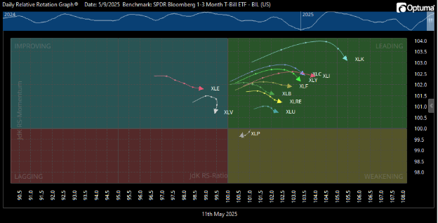
2/ RRG – Watching the ducks going around the pond
Next up is a look at how the sectors of the S&P 500 are acting relative to T-Bills using RRG (Relative Rotation Graphs) created by Julius de Kempenaer. I like to refer to this as watching the “ducks go around the pond,” as the sectors will tend to rotate in a clockwise circle around the graph.
As of Friday, most sectors of the broad index have moved well into the Green (Leading) box. And that’s great! A few weeks ago, they were all clustered in the Red (Lagging) box, which is where market rallies tend to start. But now, the sectors are looking tired: the arrows are starting to point downward towards the Yellow (Weakening) box. While that isn’t a clear sell signal, it is a condition to pay attention to.
Re-reference the Seasonality chart above and there appears to be a sharp drop sometime in mid-May. If the S&P 500 sectors start to roll over and push downward, then I’d expect a pullback to start. But for now, we still have to watch and wait. We’ll revisit this a couple of times this week to watch it play out.
XLP (Consumer Staples) is already heading towards the exit, and XLV (Healthcare) appears as if it will skip the Green box and go straight back into Red. And way up in the top right – XLK (Technology) is turning over faster than many other sectors. That tends to lead the way in both rallies and pullbacks. So keep an eye on that one.
I post these on Twitter each Friday so you can watch the “ducks” swim their laps.
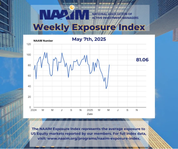
3/ I’ve been a long-time contributor to the NAAIM Exposure Index and find it helpful to compare my view of the market to that of other financial professionals. It indicates to me how much relative conviction I have vs. other active managers in showing how much equity exposure is allocated to the market at a given time. It can also be helpful as a contrarian indicator in some instances.
Last week, the Exposure Index had a big rebound, back up above 80 – a typical reading for an up-trending market. Recently, this index has been lagging behind in catching up to the market rebound. But hey, don’t look at me; I’ve been reporting numbers just over 100 during the past couple of weeks, far exceeding the consensus of this community.
I also always appreciate Rob Hanna’s work (Quantifiable Edges), which shows that a NAAIM Index pullback into the 40 area can correspond to a short-term rebound rally over the following week or two. But again, it is not a signal, but a condition. Follow your setups and trade accordingly.
To sum up the situation going into this week: Seasonality suggests caution and the potential for a brief speed bump ahead. Most S&P 500 sectors seem to agree that this event could happen sometime this week. On the other hand, general sentiment does seem to be improving, and it’s good to see other managers finally catch up on this trend. I’m optimistic but cautious going into this week, as ultimately, the market still does whatever it wants.
Unlock exclusive gold and silver trading signals and updates that most investors don’t see. Join our free newsletter now!